
Building a fashion marketplace where closets become personal brands

OVERVIEW
A closet that feels like yours
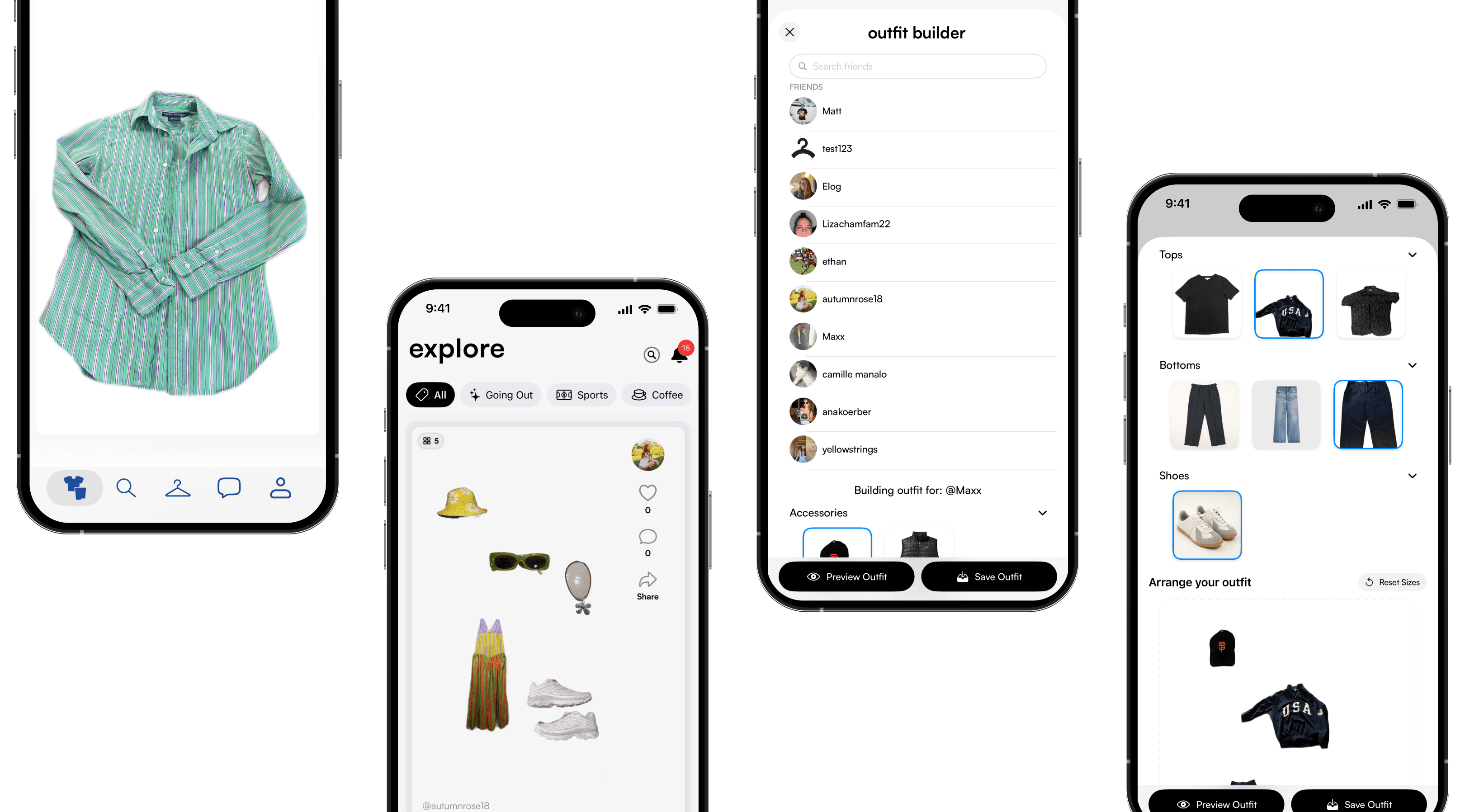
In an era of fast fashion and algorithmic feeds, personal style has become homogenized. Cinched. is a vintage resale and style platform that rejects the "trend cycle." It allows users to build digital closets, create outfits, and share their aesthetic authentically.
As the sole Product Designer working directly with the co-founders, I led the design from ambiguous concept to a functional MVP. I was responsible for the UX strategy, information architecture, visual identity, and the creation of a scalable design system for both web and mobile.

THE INSIGHT
Why we built this
The Problem: Outfit Fatigue
Users have closets full of clothes but nothing to wear. They are paralyzed by "Fast Fashion" algorithms that push purchasing over styling. They didn't need a store; they needed a tool.
87 %
of users want to style before they buy
The User Problem
"Outfit Fatigue." Interviews showed users have full closets but nothing to wear because they lack the tools to visualize combinations. They are tired of algorithms telling them what to buy.
Business Goal: Retention
Resale apps suffer from "buy and bye." By building a daily utility (The Digital Closet), we create a reason for users to open the app every morning, not just when they shop.
DESIGN PROCESS
How Depop and Poshmark compare
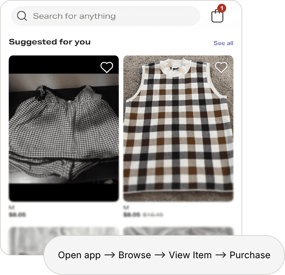
Both have strong discovery and social features, Depop’s hashtag-driven browsing and seller profiles, Poshmark’s Posh Parties and bundling, but both are structured around transactions.
Depop added an Outfits tool in late 2025 for styling shoppable collages, and Poshmark’s ‘closet’ refers to a seller’s inventory, neither gives users a private space to catalog and combine pieces they already own.
Cinched’s digital closet is built around the opposite goal: reducing purchases by making your existing wardrobe usable again, not increasing them.
-Participant 3
Where They Fall Short
Conducted parallel research streams: 15 interviews with vintage enthusiasts actively using resale apps, alongside a direct audit of Depop and Poshmark.
1: Commerce-First Mindset Limits Creative Expression
The Problem: All platforms optimize for transactions. User flows funnel toward purchases. Social features feel secondary, tacked-on.
2: Item Overload
The Problem: Apps typically focus on individual product listings rather than helping users visualize how pieces work together.
DESIGN AND ITERATION
Wireframing, prototyping, usability testing
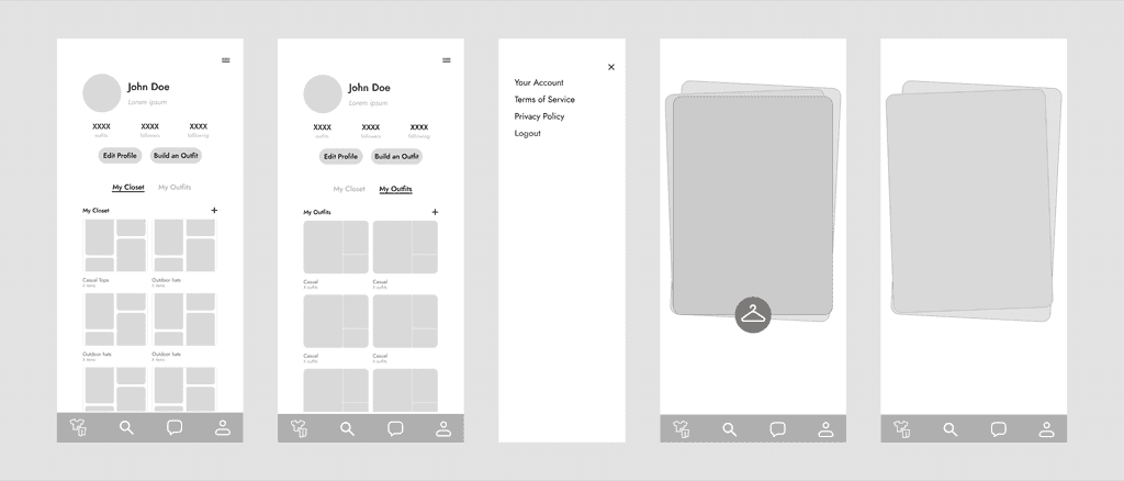
I tested three approaches for the outfit builder, the hero feature: drag-and-drop, swipe-to-add, and template-based. Drag-and-drop was selected for its playfulness and flexibility.
We chose drag-and-drop based on what felt most playful and lowest-friction during early build reviews. We didn’t have the user base yet to formally A/B test the three approaches against each other, that’s on the roadmap once we have the traffic to support it.
What we tried and left behind
Swipe-to-add
We tried a Tinder-style swipe interface for adding items to an outfit. It felt fast, but users lost the ability to see multiple pieces at once, which mattered more for outfit-building than speed did.
Template-based
Pre-set outfit templates would have been the fastest build path, but they worked against the whole premise of the app, personal style, not a formula. We cut this one first.
I also experimented with stacked card interactions for closet item selection, to test how playful and tactile the experience could feel.

THE SOLUTION
Six core features that celebrate personal style
I designed Cinched around the idea that your closet should feel like a playground—a space to experiment, create, and share without pressure or judgment.
Users select up to three fashion styles that showcase their personal aesthetic.
A drag-and-drop tool for combining pieces you already own.
Wishlist
Swipe-right discovery for saving the pieces you want.
In-person Pop-up Metrics
Cinched shipped as a functional MVP, live with the outfit builder, digital closet, and wishlist. We put it to a real-money test at our first in-person pop-up in Austin, TX: $127.65 across 9 sales in a 3.5-hour session, 80% of it through Apple Pay, with zero sales lost to friction, including one buyer who waited out a checkout hiccup rather than walk away. Card buyers spent roughly 2x more per order than cash buyers ($17.11 vs. $8.33).
That signal, real demand and real money changing hands, is what moved seller storefronts from a backlog idea to our next build priority.
Closet-feature engagement metrics aren’t available yet since we hadn’t instrumented usage tracking during this build window. Adding analytics to measure return visits and outfits created is the next infrastructure priority alongside seller storefronts.
Reflection & Lessons Learned
Going into this project, I prioritized the styling side of Cinched over the transactional side, treating buying and selling as necessary infrastructure rather than a design priority. The Austin pop-up changed my mind. Watching $127.65 change hands in three and a half hours made it clear that real commerce was happening whether or not I'd designed for it as a first-class experience. User research tells you what people want to do, but watching real money move tells you what they're already doing, and the second one can override the first.
© Camille Manalo 2026