
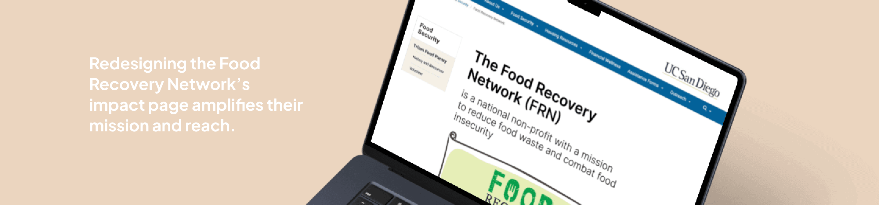
Food Recovery Network
Product Designer
UX Researcher
ROLE
TIMELINE
Sept. 2024 - Dec. 2024
Prototyping
SKILLS
Interaction Design
Wireframing
OVERVIEW
At UC San Diego,
43% of surveyed students experience food insecurity on campus. The Food Recovery Network (FRN) addresses this by recovering surplus food from dining halls, markets, and grocery stores to distribute to students in need.
Our Challenge?
Our team of six designers reimagined FRN’s impact page to enhance user engagement, clearly communicate FRN’s mission, and improve accessibility for students, staff, and potential donors—all within a 10-week timeline and university CMS constraints.
Throughout the process, we collaborated with Beatriz Chavez Vega, FRN’s Food Security Programs Assistant, who provided valuable feedback on our designs, ensuring they aligned with FRN’s goals and user needs.
THE PROBLEM
The previous impact page lacked clarity and engagement, making it difficult for students and partners to access key information.
So we asked ourselves the question:
"How might we make an engaging and user-friendly impact page for FRN that effectively communicates its mission and impact to students, staff, partner organizations, and prospective donors that could benefit from the organization’s service(s)?"
THE SOLUTION
Voilaaaa!
This redesigned impact page transforms how users, new and old, engage with FRN's mission to fight food insecurity. We made sure to prioritize clear navigation, impactful visuals/data visualization, and streamlined content.
How'd we get here? Well, let's start from the beginning!
BACKGROUND RESEARCH
First and foremost–field trip to our campus FRN!
To craft a user-centered solution, we began with on-site research. Visiting the FRN chapter on campus, I interviewed FRN staff, volunteers, and students to truly understand how they interacted with the website.
Key Insights
Can't easily find hours
Users struggled to quickly locate distribution hours on the page.
Hard to find their stats
FRN’s food recovery stats and community impact were buried in dense text.
Confusion over
resources
Many students didn’t understand the distinction between FRN and the Triton Food Pantry.
With these insights, we had a clear direction: make key information accessible at a glance, use visuals to tell FRN’s story, and create a seamless user experience.
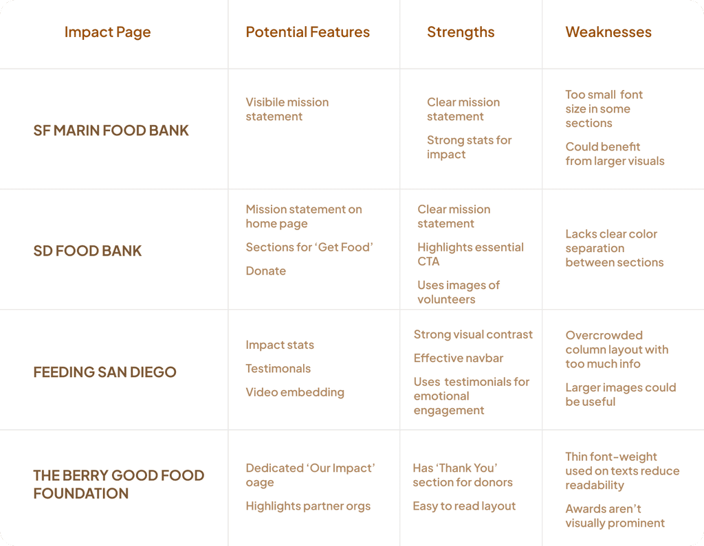
Then, we took a deep dive into a SWOT Analysis to see what worked.
IDEATION
So how would a solution look like? (left to right)
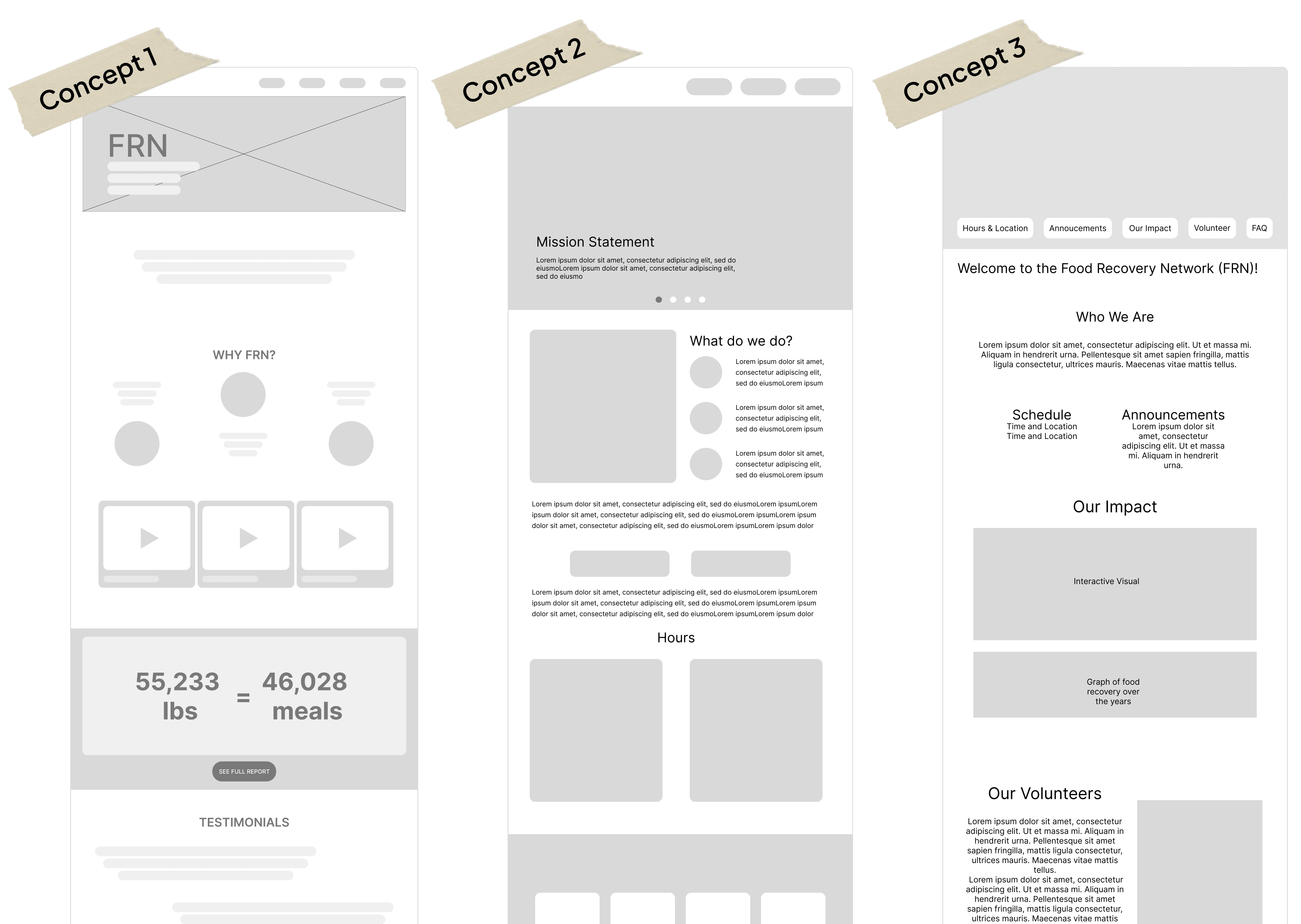
Now what? Let's narrow down what we want to change or implement on the website
We found ourselves deciding on a hybrid concept that would be succinct, but include a scroller gallery (desirable interaction) plus the hours from concept 2 (functionality), and a volunteer/community section from concept 3 (for desirable emotional connections and values).
We conducted A/B User Testing on 6 users–5 being student workers that were part of FRN or Basic Needs Staff and 1 being a student/general FRN user; we wanted to see what layout and flow users found more efficient and intuitive.
Mid-Fi # 1
interactive elements (e.g. hover-on photo carousel, time cards, funy 'honey the van' animation
clear division of sections, spotlighting mission statement, included 'how it works' section
needs more information in how FRN differs from Triton Food Pantry
Mid-Fi # 2
informative history + volunteer pages
lack of graph labels, emphasis on absence of point system
more concise color theme
Revise. Revise. Revise.
Our findings revealed clear patterns. Despite being labeled an “impact page,” users primarily sought it out for key information, underscoring the need for strong content hierarchy and clear flow. Crucial content includes distribution time and location (which should be most prominent), how FRN works, how it differs from the Triton Food Pantry, and a FAQs section.
Users also associated photos, mission statements, interactive elements, and history with authenticity and outreach, suggesting these emotionally resonant features should be emphasized to convey impact effectively.
Final Thoughts
Positive Outcomes:
The redesigned page was preferred over the original by all users tested.
Users found the new design to be colorful, effective, straightforward, and engaging.
Key information, like distribution hours, was made readily available at the top of the page.
The team successfully created an informative page that could motivate users.
Limitations and Lessons Learned:
Small sample size for usability testing.
Low participant diversity in user testing, with a focus on FRN staff over general students.
Potential for participant bias due to close relationships with FRN staff.
The team recognized the need for ongoing communication with FRN after project completion.
Future improvements include educational sections on food date labels.
Sustainability:
The new impact page can help the FRN secure funding by showcasing their work.
The website includes testimonials to strengthen connections with users.
By showing partnerships, the website increases brand awareness.
Check out our final presentation deck here!
Let's connect!